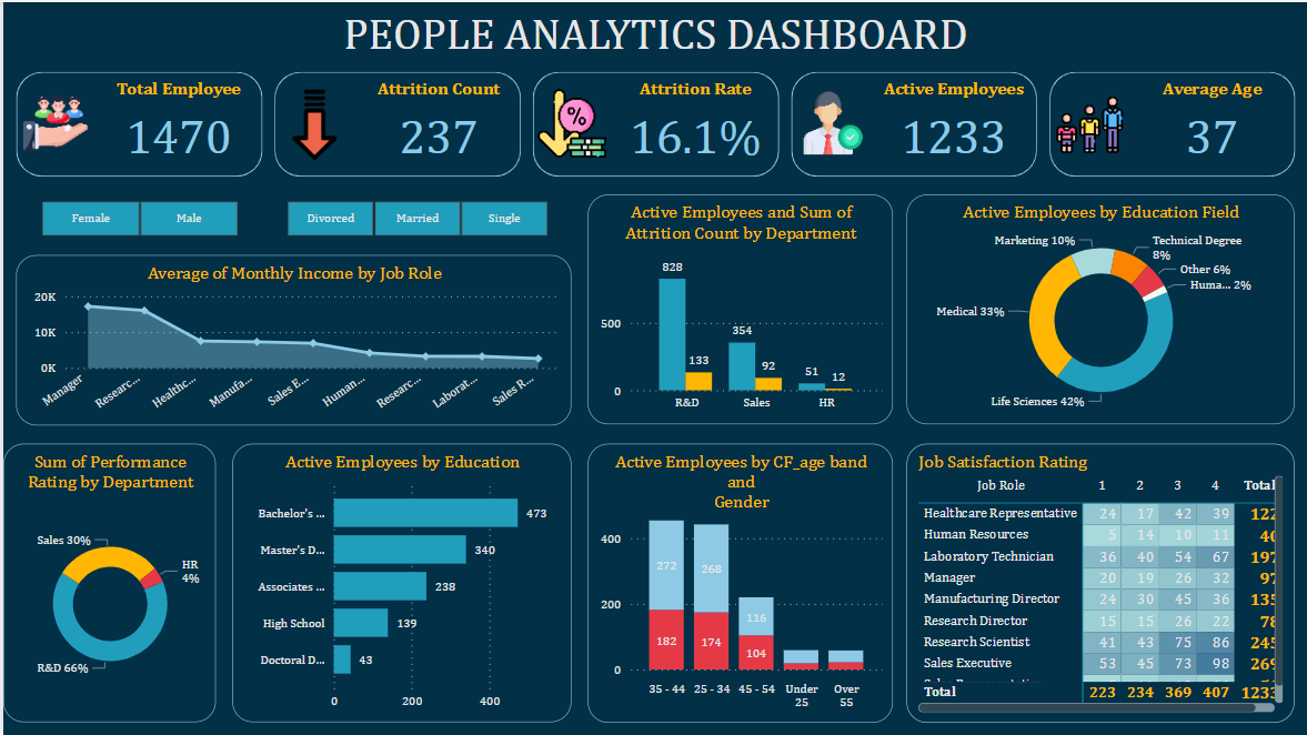
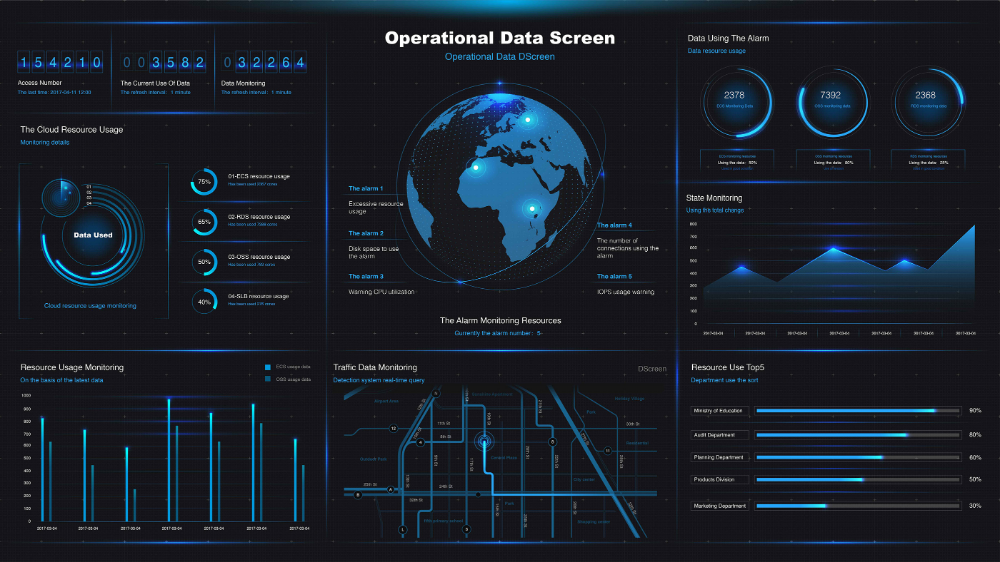
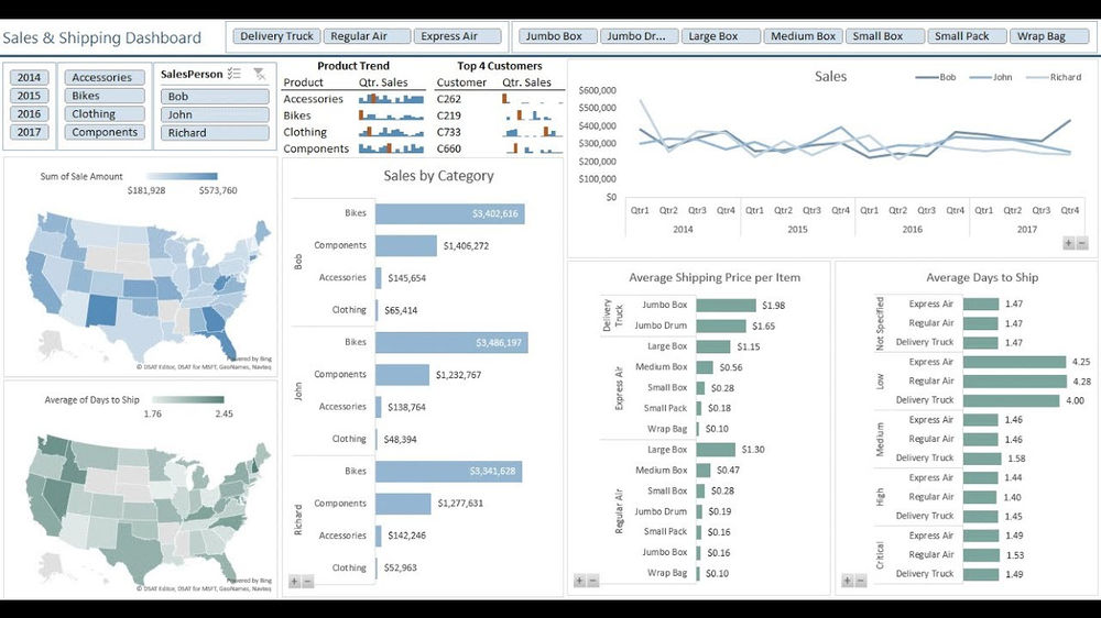
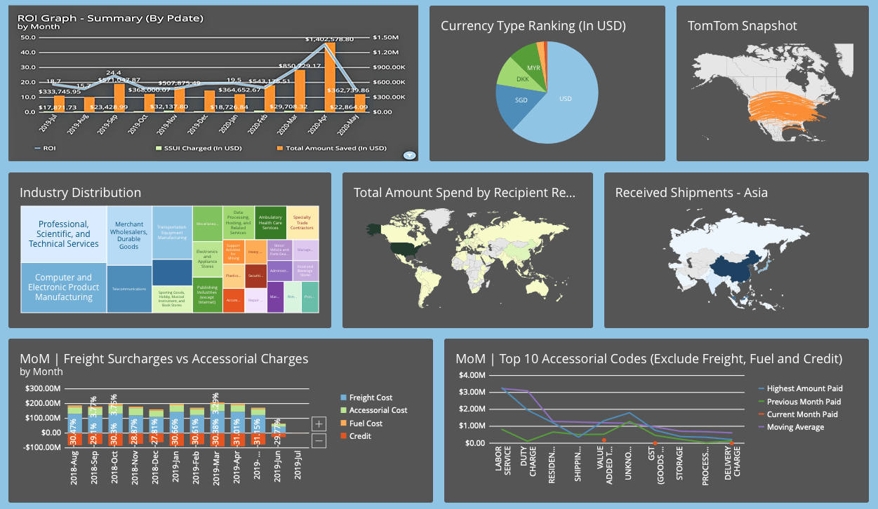
See the Story Behind Your Data — Instantly and Intuitively
Raw data means nothing until it’s visualized effectively. At Procept, we turn complex datasets into clear, interactive dashboards and visual reports that help you monitor, analyze, and act in real time.
Our data visualization solutions make business intelligence accessible to everyone — from executives to analysts — through stunning charts, graphs, and KPIs that bring clarity and insight to every corner of your organization.
What We Offer:
✅ Interactive Dashboards
We build live, role-based dashboards that provide instant visibility into key business metrics — allowing decision-makers to track performance at a glance.
✅ Advanced Data Visualization Design
Custom visual layouts using bar charts, line graphs, heat maps, gauges, pie charts, geo-maps, and more — designed for clarity and storytelling.
✅ Real-Time Data Connectivity
Connect your dashboards to real-time data sources (APIs, databases, cloud apps) for always-updated insights.
✅ Tool Expertise
Expert implementation with leading platforms like Power BI, Tableau, Looker, Google Data Studio, and custom JS-based visualizations (D3.js, Chart.js, etc.)
✅ Mobile-Responsive Dashboards
Access insights on the go — dashboards are fully optimized for desktops, tablets, and smartphones.
✅ Custom Alerts & KPIs
Set data thresholds and receive real-time alerts for anomalies or critical performance indicators.